I have to start off by saying this campaign was a miracle project in more ways than one for me. First, even though the specific task concerning the icons was rather difficult (these are some hard topics to conceptualize into a simple icon), this campaign was completed in two weeks. Second, something that attributed to the speedy delivery, this was the first time having a client respond back with zero revisions. There are projects were you are banging your head against the wall, and then there are those beautiful gems of a project where it seems everything just flows naturally out of you. This was one the latter.
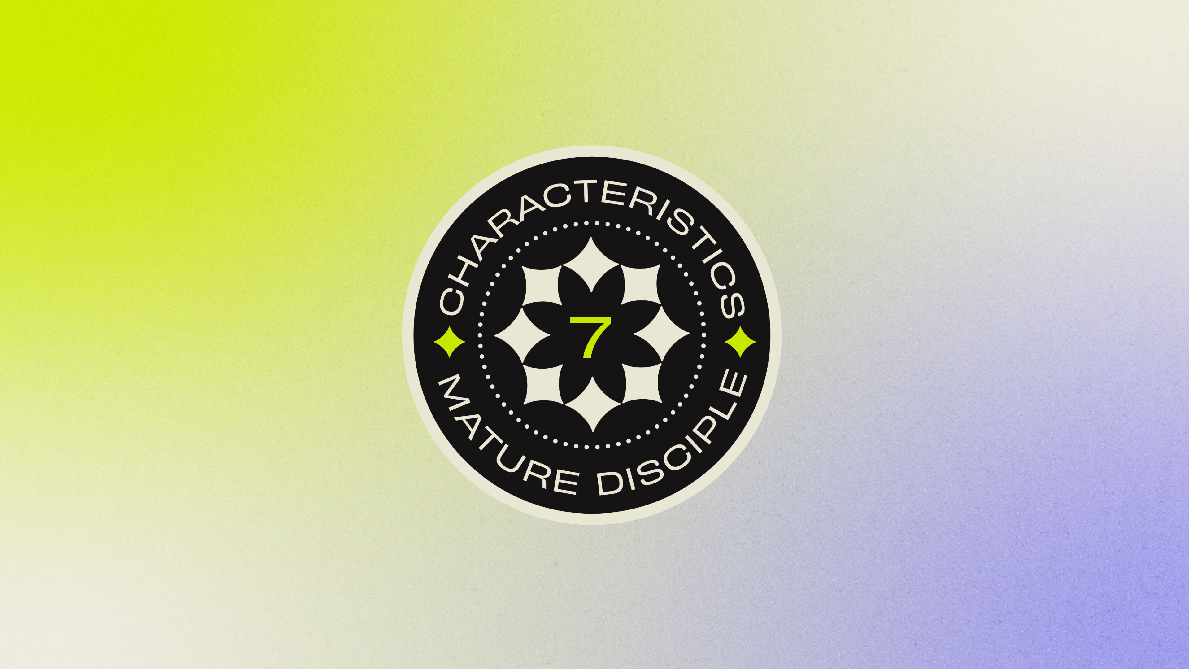
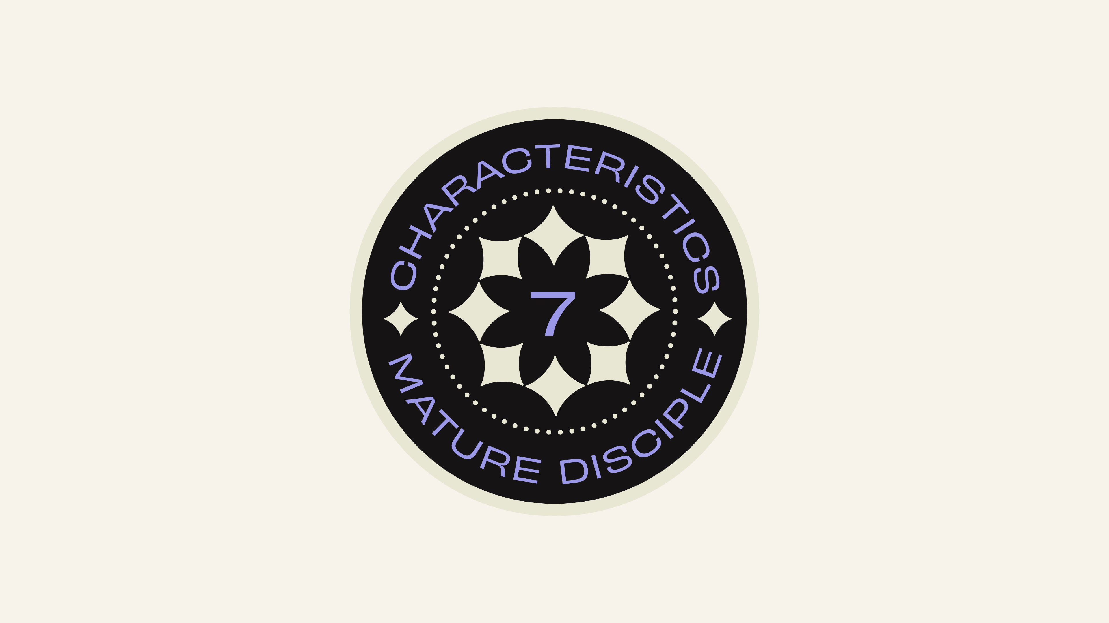
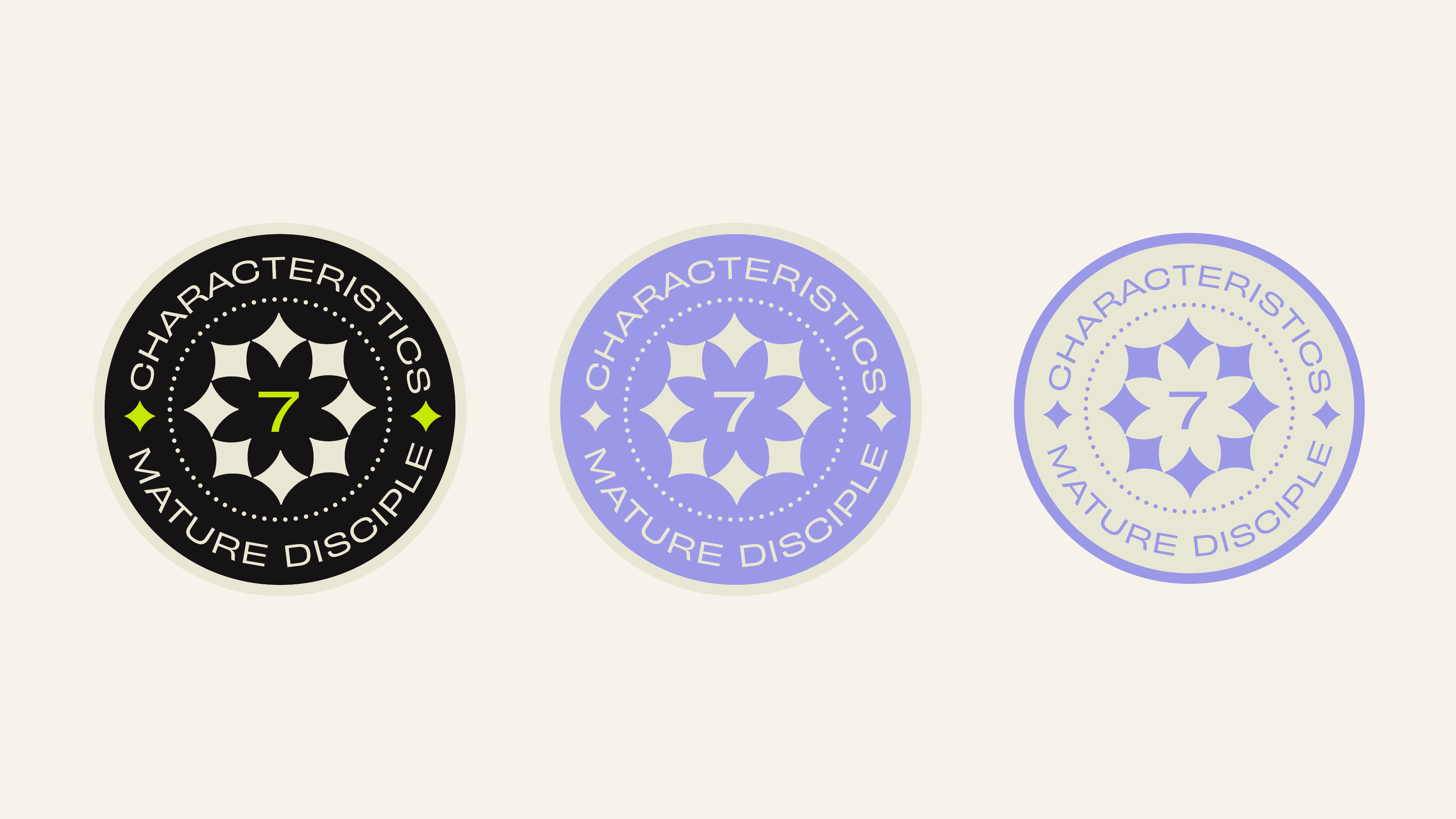
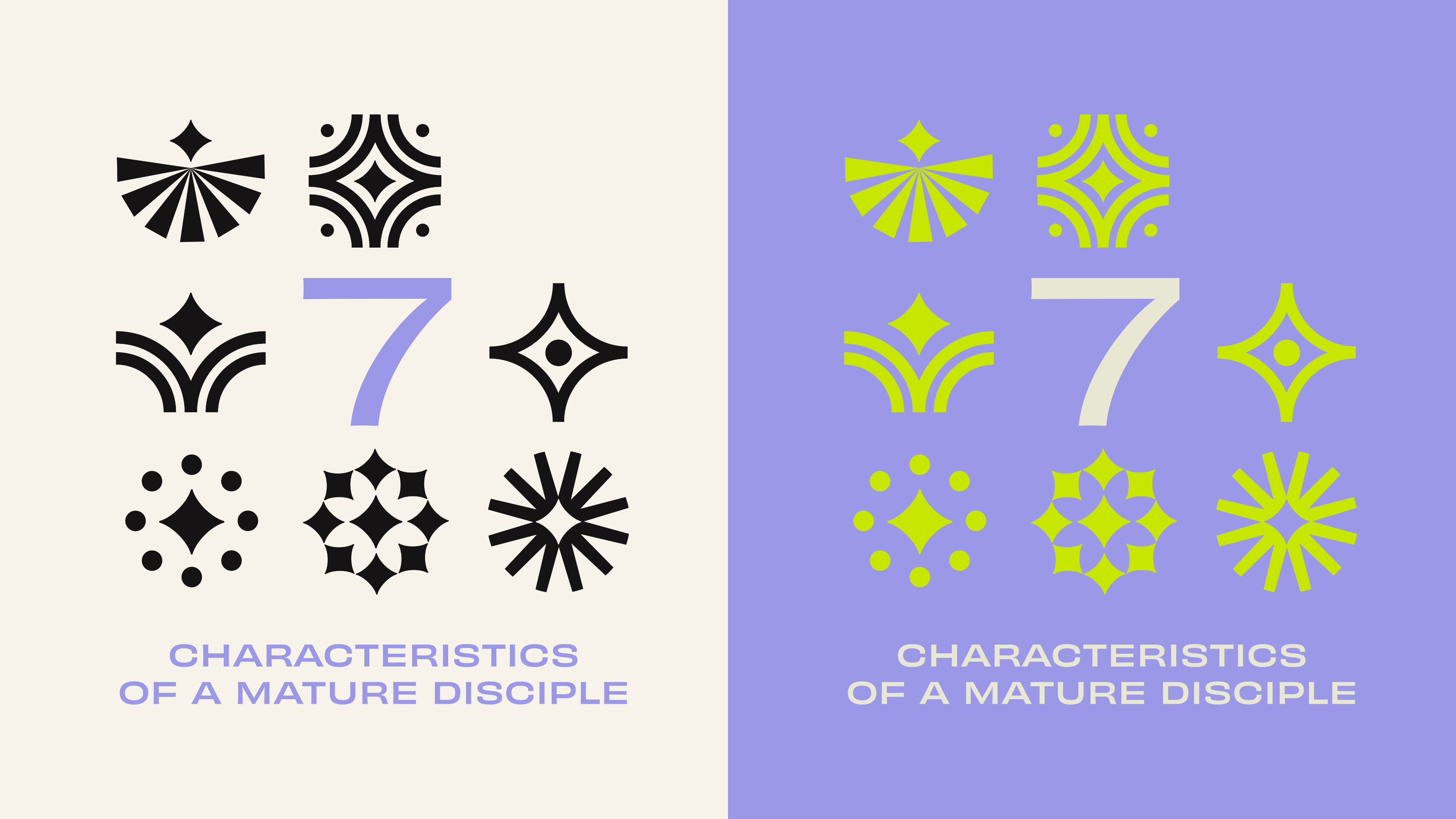
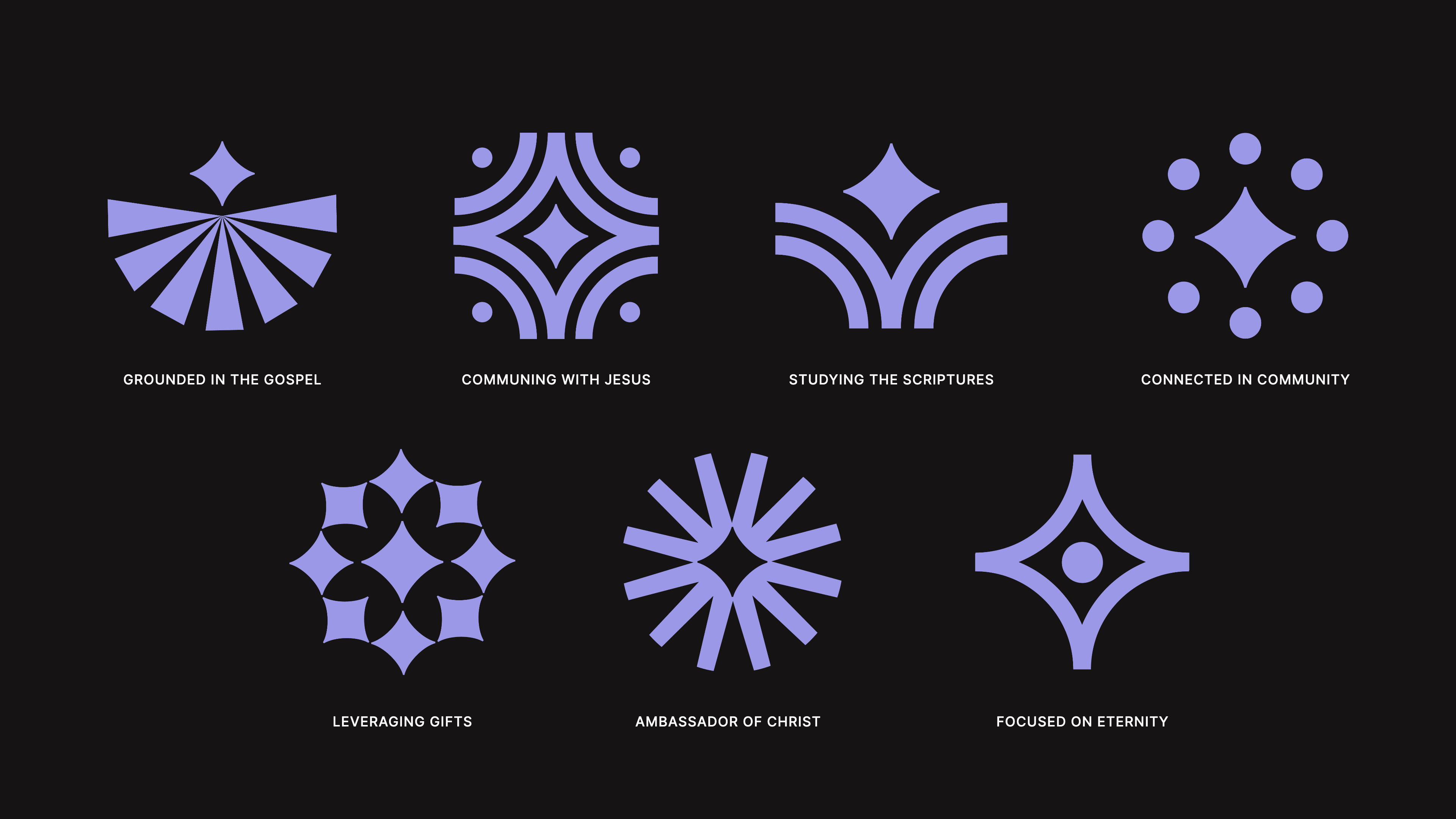
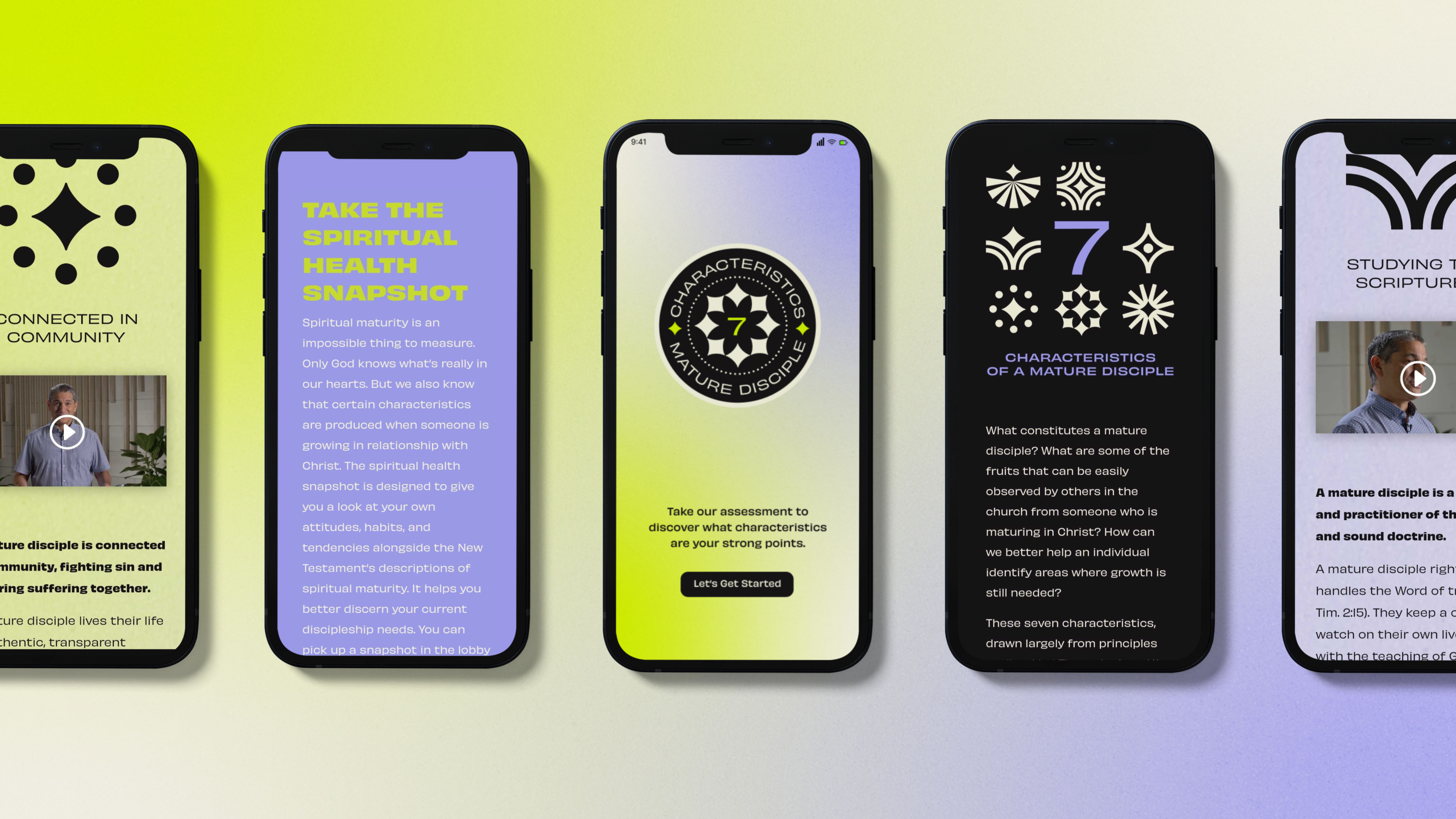
The foundation of this campaign design are the icons, which is were most of my time was spent. I spent hours sketching, trying to take the idea of a flower — which represents us, or the disciples — rooted in the ground. Eventually the flower was reduced down to its most simple form. A diamond. The colors were chosen to represent a healthy (chartreuse) spiritual life (lavender).
I hope you enjoy looking at this campaign as much as I enjoyed working on it.