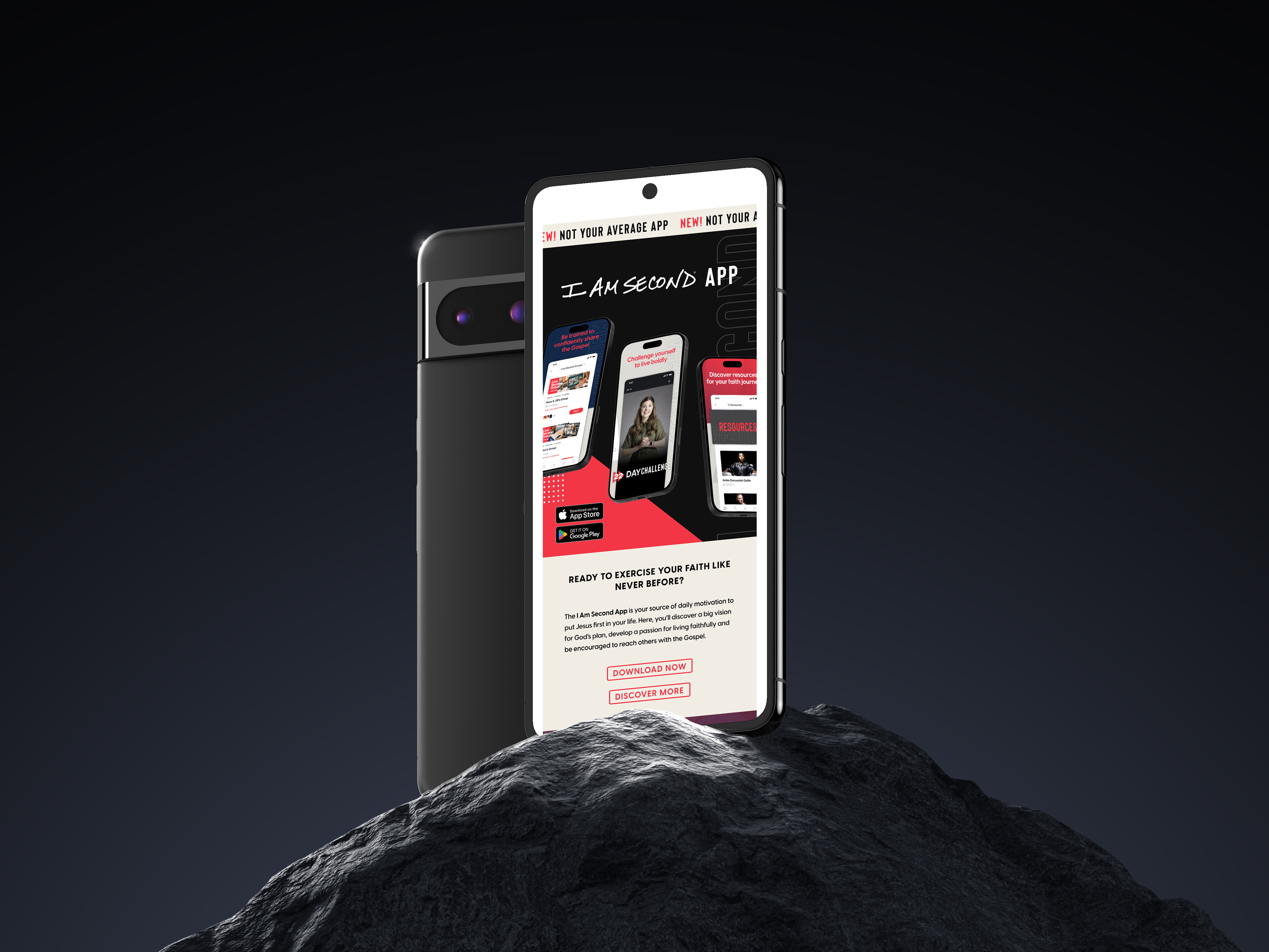
We needed to attract a younger audience and we needed these emails to be quicker tasks for the design team. These were the main issues we faced, externally and internally, with the monthly I Am Second merch email. Thankfully, all of the solutions for making the email more efficient to design also made it more tailored to a younger audience.
In the new email design I made the hero image reliant on photography, as opposed to it being a heavy design lift. We planned a budget-friendly photoshoot in our in-house studio and captured content for both web, social, and emails that would last us through the seasons until Spring 2025. The new template also limited how much copy could go on the hero banner, making it feel cleaner. The copywriters felt the sub-header was important to keep, so I created a place for it off the hero banner so it wouldn't clutter the hero banner but still lead you into the top picked products for the month.
This project was apart of a complete overhaul of our main content emails (film launches, merch, and our monthly newsletter). The objectives of the overarching project were to:
1. Create visual diversity between the three emails. All our emails looked the same and we wanted it to be more clear what email you were getting from first glance.
2. Limit the number of CTAs each email had. This would improve email performance and create less confusion for the receiver.
3. Make the emails visually less clunky and more of a seamless flow between the sections of information.
OLD TEMPLATE
NEW TEMPLATE
CREDITS
Art Director (Design & Photography)
Amber Andersson
Amber Andersson
Graphic Designer
Amber Andersson
Amber Andersson
Design Researcher
Amber Andersson
Amber Andersson
Web / CRM
Jordan Evans
Jordan Evans
Social Media Photographer
Karis Byun
Karis Byun
Photographer
Jeremy Sharp
Jeremy Sharp
SOFTWARE
Figma
Adobe Illustrator
Adobe Photoshop
Adobe Lightroom
Adobe Illustrator
Adobe Photoshop
Adobe Lightroom
