
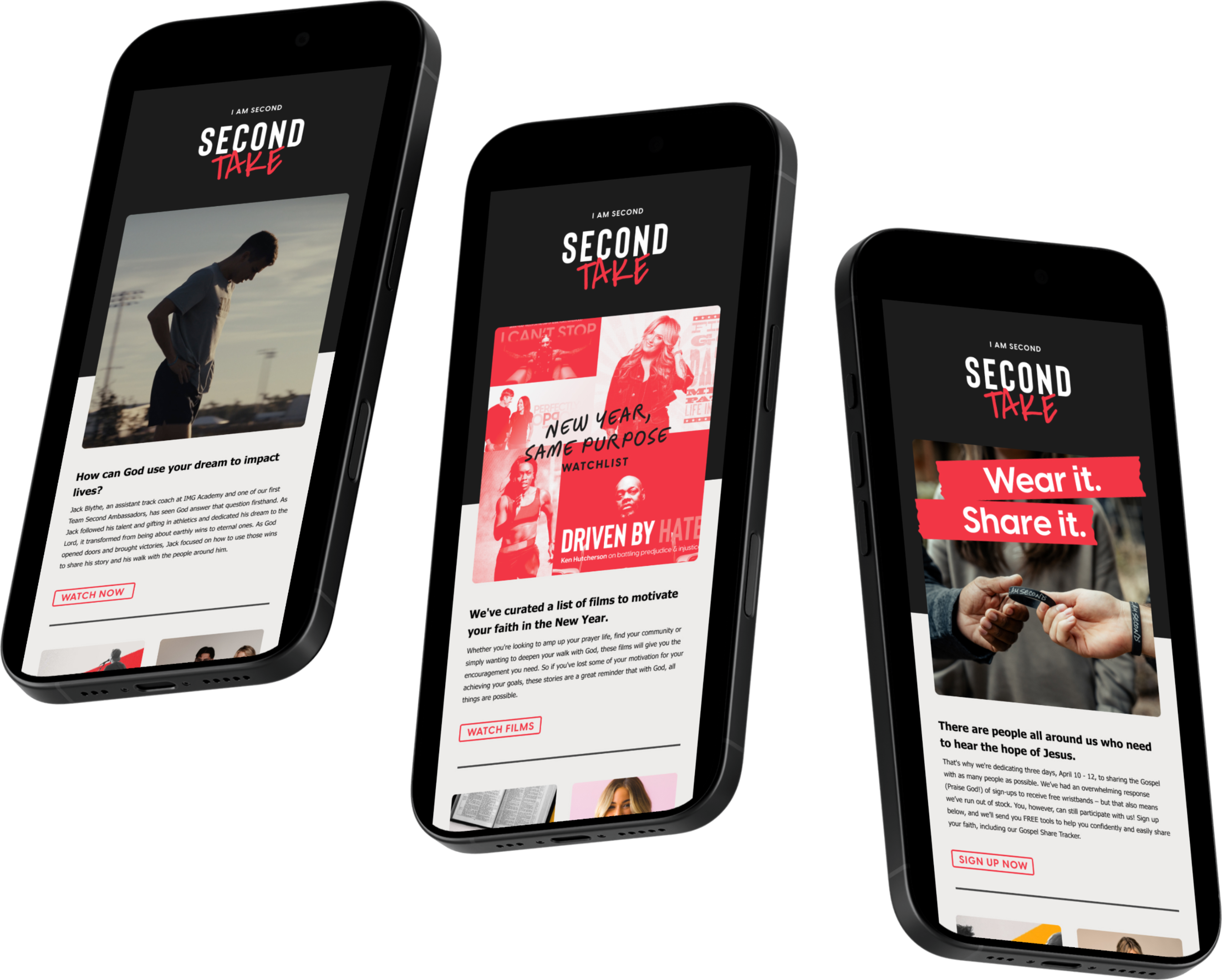
It is common that a newsletter would have more CTAs than most emails, however, there was no hierarchy of content in the old newsletter design. We fixed that by creating a highlight section in the new design. This section would always be the largest while the sub-categories would be smaller and meant to be quickly gleaned. Because the amount of content, and what content, changes monthly for I Am Second, I created multiple "bento box" options for the sub-categories that the copywriters could utilize and write to depending on the month.
This project was apart of a complete overhaul of our main content emails (film launches, merch, and our monthly newsletter). The objectives of the overarching project were to:
1. Create visual diversity between the three emails. All our emails looked the same and we wanted it to be more clear what email you were getting from first glance.
2. Limit the number of CTAs each email had. This would improve email performance and create less confusion for the receiver.
3. Make the emails visually less clunky and more of a seamless flow between the sections of information.
OLD TEMPLATE
NEW TEMPLATE


CREDITS
Art Director
Amber Andersson
Amber Andersson
Graphic Designer
Amber Andersson
Amber Andersson
Design Researcher
Amber Andersson
Amber Andersson
Web / CRM
Jordan Evans
Jordan Evans
SOFTWARE
Figma
Adobe Illustrator
Adobe Photoshop
Adobe Lightroom
Adobe Illustrator
Adobe Photoshop
Adobe Lightroom